PAB group
In today’s competitive market, maintaining a strong and recognizable brand identity is crucial for businesses aiming to stand out. PAB Group, a leading interior fit-out company, recognized the need for a comprehensive rebranding to better reflect its growth and the quality of its services.
This case study explores the rebranding process undertaken for PAB Group, detailing the challenges faced, the strategies implemented, and the successful outcome achieved.
PAB Group is a dynamic and rapidly growing interior fit-out company specializing in delivering high-quality, LEED-certified projects. Established over a decade ago, PAB Group has built a reputation for excellence in the commercial, retail, hospitality, and corporate sectors. The company prides itself on its commitment to quality workmanship, sustainability, and on-time project delivery. Their services range from bespoke joinery for export to comprehensive fit-out solutions for a diverse clientele, including hotels, restaurants, corporate offices, and more.
Despite its success, PAB Group faced a significant branding challenge. The existing logo and brand identity no longer aligned with the company’s evolved vision and market position. The original logo (as shown below) was outdated and did not effectively communicate the company’s modern, innovative approach and its commitment to quality and sustainability.
The primary issues identified were:
Outdated Design – The existing logo did not reflect the modern and professional image that PAB Group wanted to project.
Lack of Cohesion – The brand elements lacked a unified visual identity, making it difficult to create a strong brand presence.
Market Misalignment – The current branding did not adequately convey the company’s strengths, such as its sustainability efforts, high-quality services, and innovative solutions.
Our task was to create a new, cohesive brand identity that would resonate with PAB Group’s target audience, align with their values, and support their strategic goals.
In rebranding PAB Group, thorough background research was crucial to ensure the new brand identity accurately reflected the company’s values, strengths, and market position. Key activities included:
We analyzed current trends in the interior fit-out industry, focusing on sustainability and LEED certification. We also conducted a competitor analysis, particularly looking at Covet Group, to identify opportunities for differentiation.
In-depth interviews with key stakeholders, including project managers and senior leadership, highlighted PAB Group’s commitment to quality, sustainability, and client satisfaction. The company’s unique selling points, such as delivering on-time, high-quality projects and their expertise in various sectors, were also emphasized. Additionally, we gained insight into their vision of becoming one of the top three interior fit-out companies in the EU and plans for expanding bespoke joinery exports.
This research laid a solid foundation for creating a brand identity that is authentic to PAB Group’s core values and compelling to their target audience.
The initial sketches phase is a critical step in the rebranding process, where conceptual ideas begin to take visual form. For PAB Group, we developed three distinctive logo options that encapsulated their core values of quality, innovation, and sustainability.
This logo is a masterful fusion of form and function, embodying PAB Group’s pursuit of architectural excellence. Three meticulously designed keys, arranged in a geometric structure, symbolize the core divisions: Retrofitting, Furniture, and Monuments. The design forms an abstract house, representing PAB Group’s mission to bring creative ideas to life securely and functionally.
A captivating blend of modernity and ancient symbolism, this logo features four stylized keys arranged in a square matrix. This symbolizes the comprehensive range of services and precision offered by PAB Group, encapsulating the brand’s expertise where precision and innovation create enduring excellence.
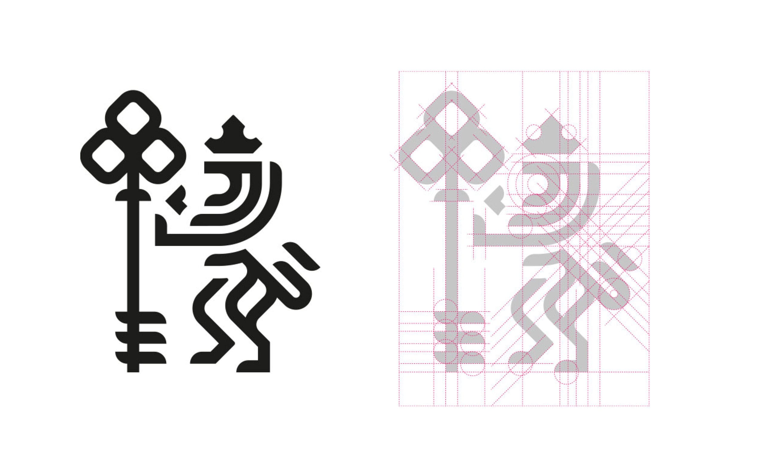
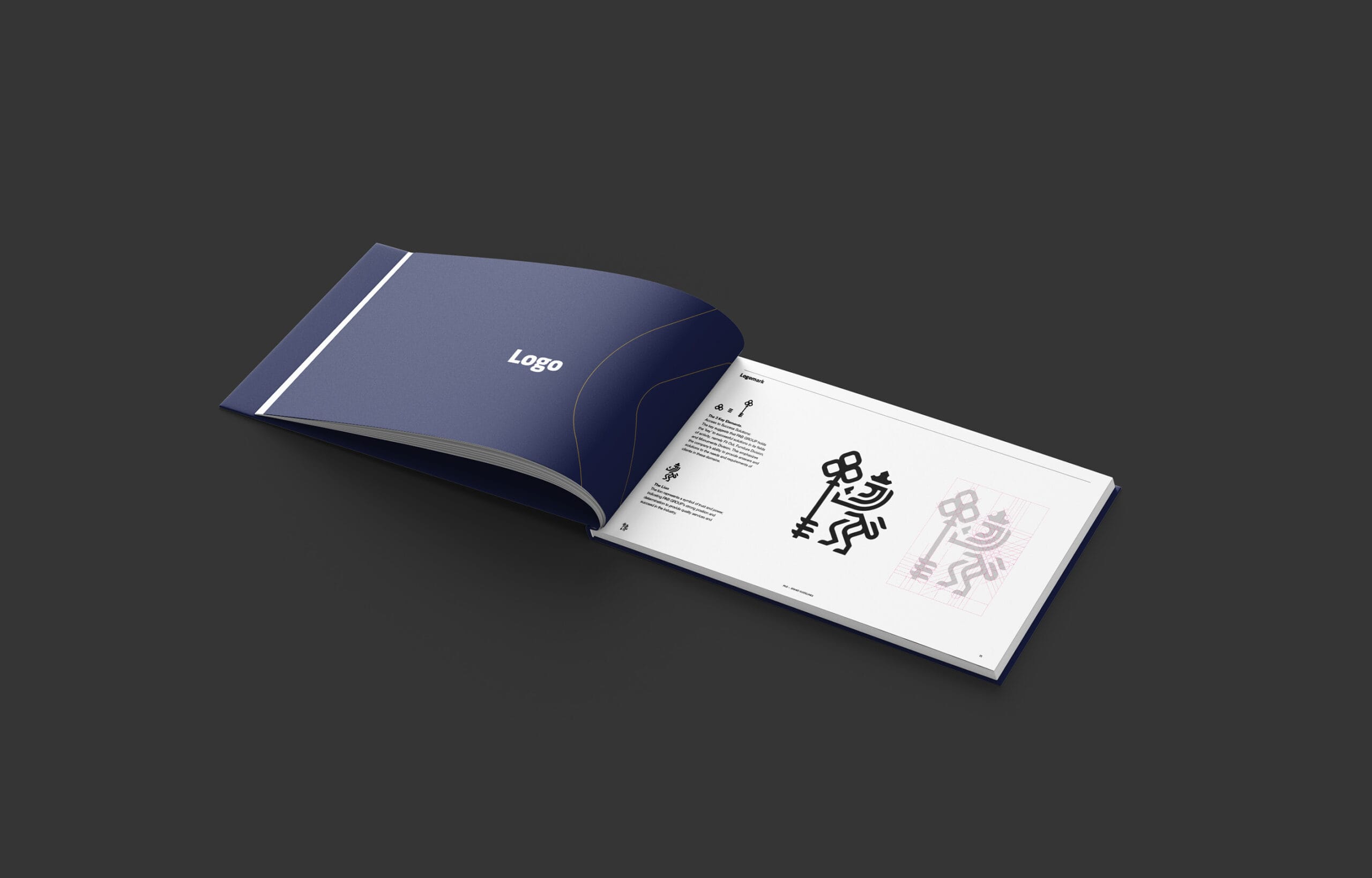
Power, courage, and stability are vital for inspiring confidence. The ‘Tri-Key Lion Logo’ features a strong, stylized lion embodying strength and courage. It holds a key with three symmetrical elements, symbolizing PAB Group’s three key divisions: Fit Out, Furniture, and Monuments. This design reflects PAB Group’s power, attention to detail, and ability to meet diverse customer needs.
After presenting the initial concepts to PAB Group, Concept 3, the ‘Tri-Key Lion Logo,’ was selected for further development. This design was favored for its embodiment of power, courage, and stability, crucial traits for inspiring confidence among PAB Group’s clients.
The initial approved version of the logo showcased a strong, stylized lion holding a key with three symmetrical elements. This symbolized the three key divisions of PAB Group: Fit Out, Furniture, and Monuments. The design effectively communicated the company’s strength, attention to detail, and capability to meet diverse customer needs.
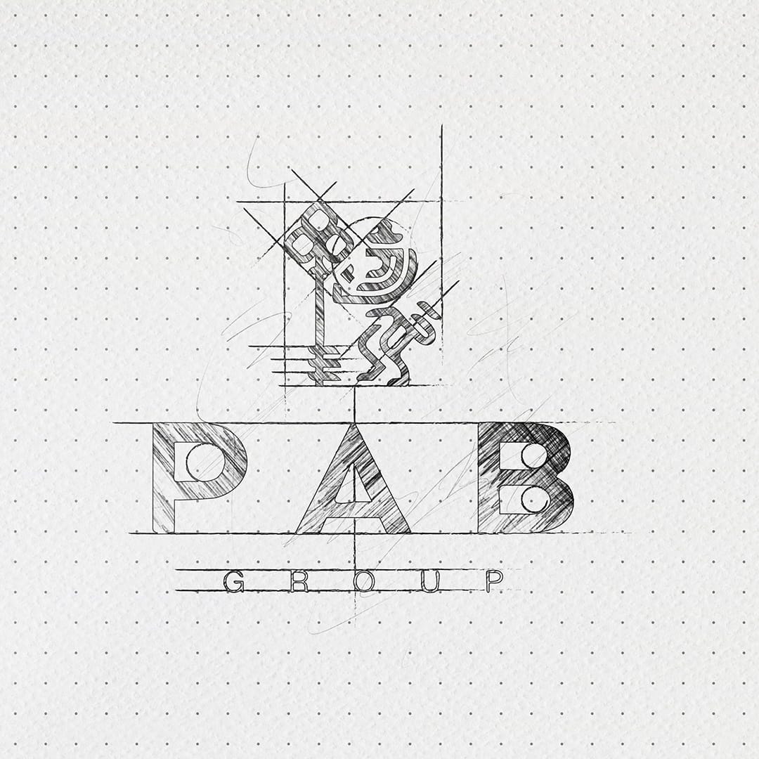
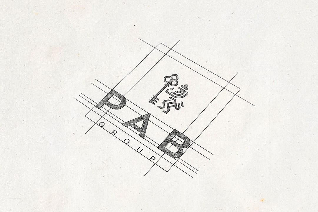
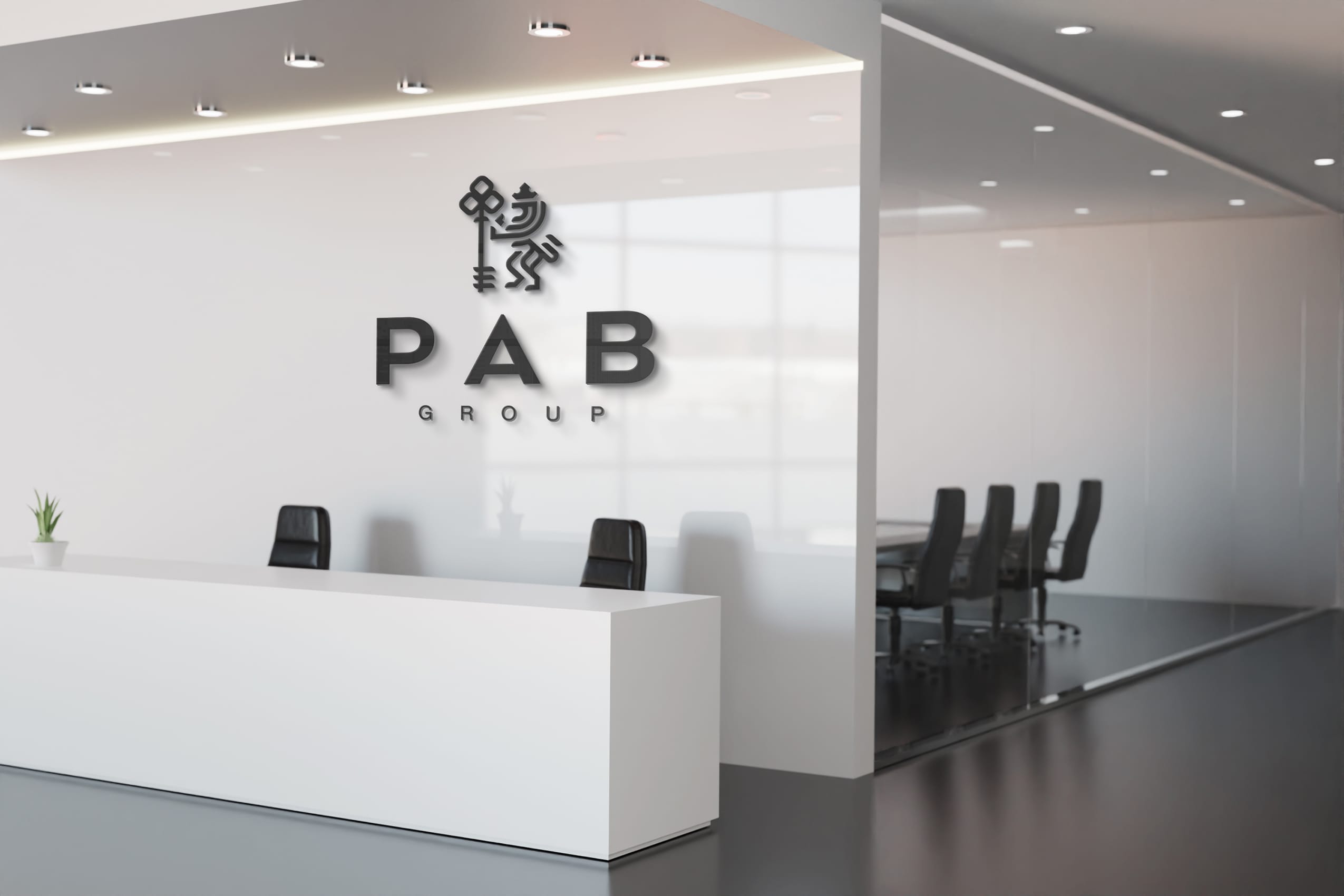
In the final stage, we made several refinements to enhance the logo’s clarity and versatility. Adjustments were made to the line weights and proportions to ensure the logo’s legibility across various media. The final design maintains the powerful imagery of the lion and the key, solidifying PAB Group’s brand identity as strong, reliable, and professional.
The rebranding of PAB Group aimed to address the issues identified during the research phase and to fulfill the client’s needs for a modern, cohesive brand identity that communicates their values and market position effectively.
The chosen ‘Tri-Key Lion Logo’ successfully embodies power, courage, and stability. It visually represents PAB Group’s three key divisions: Fit Out, Furniture, and Monuments, thereby encapsulating the company’s core competencies. The stylized lion holding a key with three symmetrical elements illustrates strength and attention to detail, which are essential attributes for PAB Group.
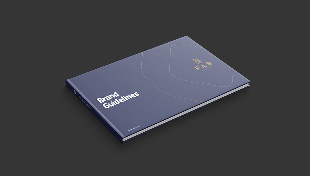
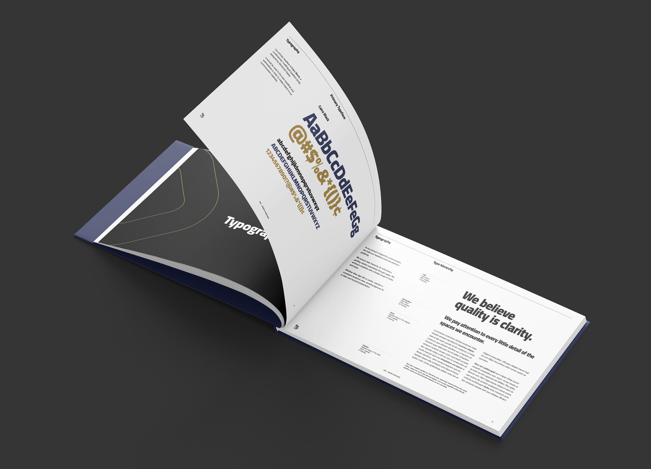
The comprehensive brand guidelines ensure consistent application across all media and touchpoints. The guidelines include specifications for logo usage, color palettes, typography, and other visual elements to maintain brand integrity.
The rebranding project for PAB Group resulted in a visually cohesive and modern brand identity that accurately reflects the company’s values and market position. The new logo, brand guidelines, and various branded materials address the problems identified in the research phase and meet the client’s needs for a strong, recognizable brand. The new identity empowers PAB Group to communicate their expertise, quality, and innovative approach effectively to their target audience.