ANTIK – Where origin meets appetit
Antik is family owned business, a culinary brand with a triple appetite: food, pizza, and gelato. Born in Alba Iulia, Romania, a city known for its history and the iconic seven-pointed fortress. Antik mixes tradition with taste, serving up comfort with a contemporary twist.
But as the business grew, its identity didn’t. The flavor was there. The story? Not quite.
Antik needed more than a facelift. It needed a framework, a system that could stretch across categories without losing its soul. A brand that felt like Alba Iulia but worked like a franchise. Something rooted, recognizable, and ready to scale.
Despite a strong local following, Antik had a few blind spots:
• The three verticals: food, pizza, and gelato – looked and felt disconnected.
• Visual consistency was thin. Brand recall? Lower than the oven temp.
• The heritage of the brand, its origin story, and its reason for being were nowhere to be found in its visuals.
Our mission was to turn that around.
To create a brand that’s coherent but flexible, emotional but functional.
One that doesn’t just look good on a pizza box, it builds a connection. Making Antik more memorable, meaningful, and scalable.
Before we designed, we dug in. Deep. No templates, no shortcuts.
Here’s how we got our hands metaphorically saucy. We reviewed regional and national industry competitors with multi-category structures. We ran stakeholder interviews to uncover real values and vision (spoiler: it wasn’t just “make it red or bigger”), and we had real conversations. We explored local cultural markers, especially the seven-pointed Alba Iulia fortress, as visual and emotional anchors. Then we defined key emotional ingredients: authenticity, community pride, product diversity, and flavorful tradition.
All this gave us the backbone. This strategic foundation informed every visual decision that followed.
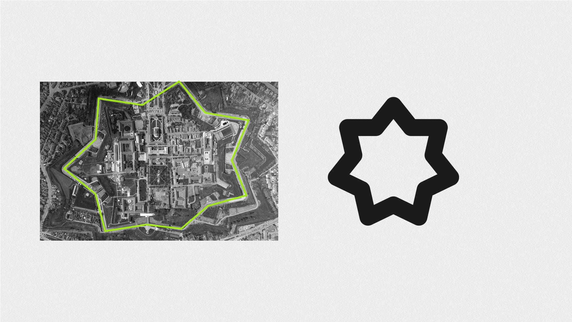
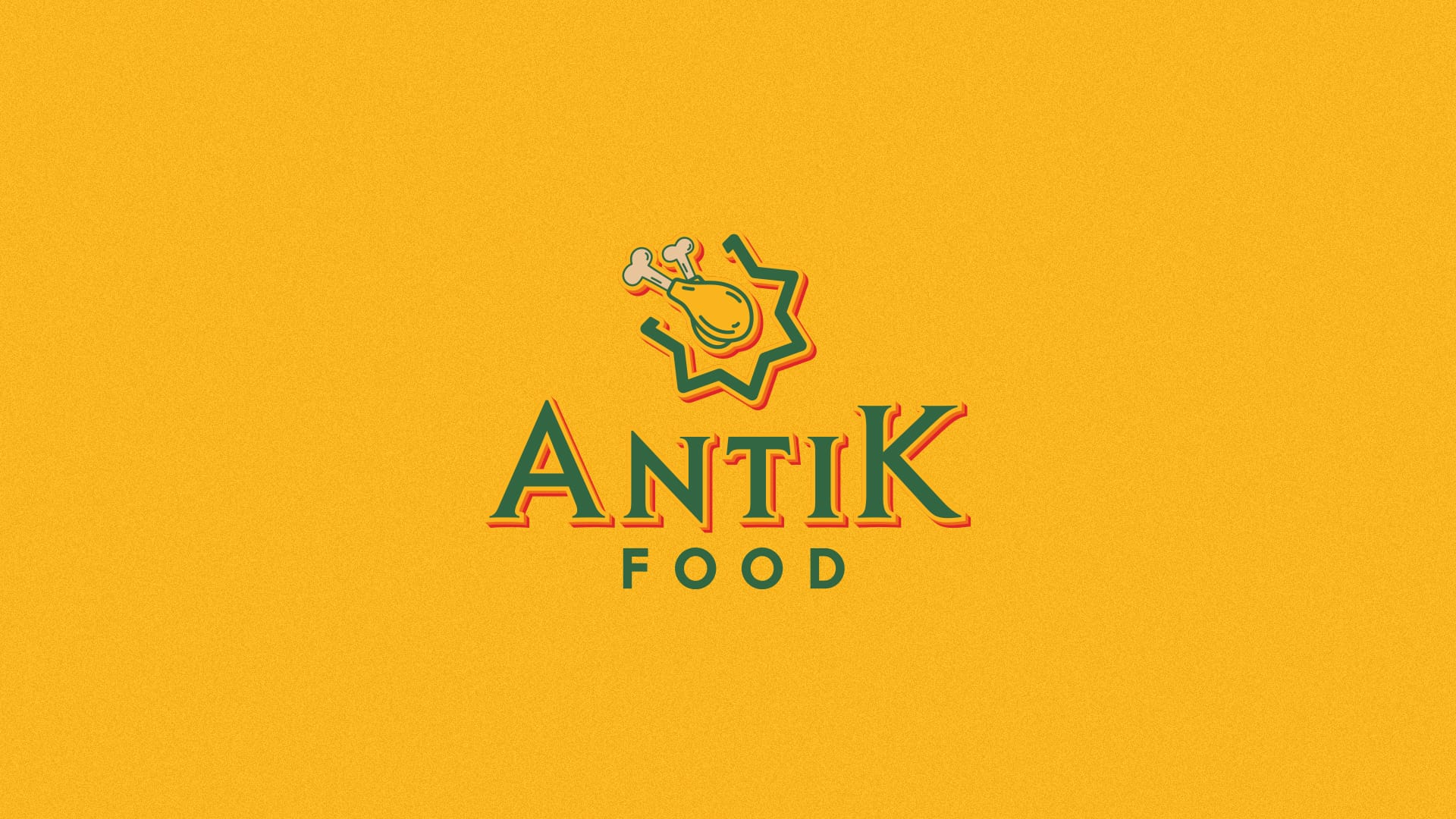
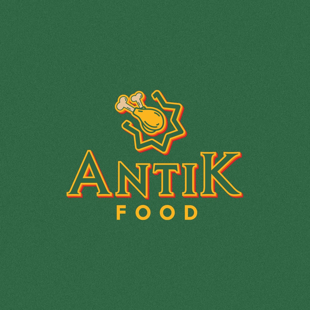
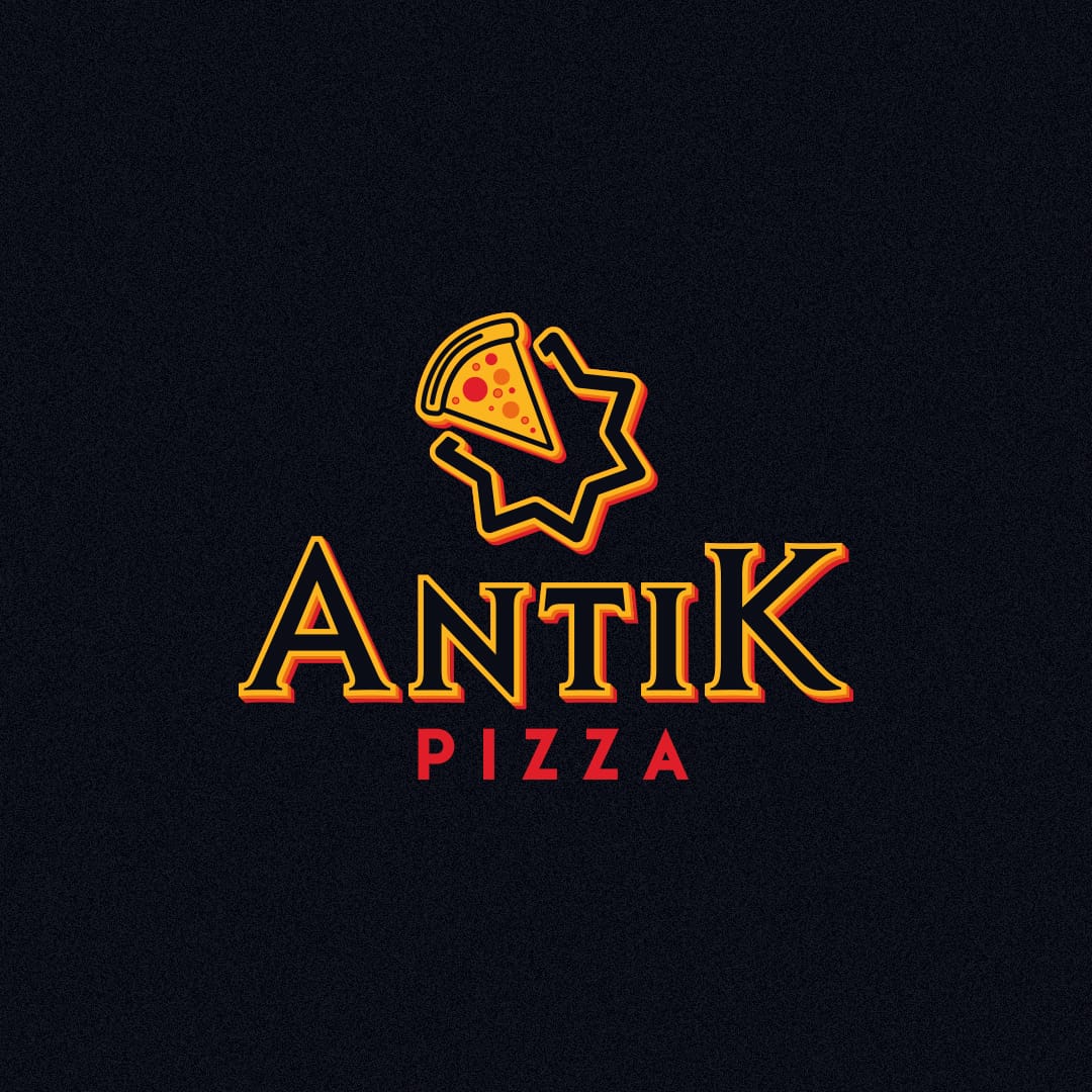
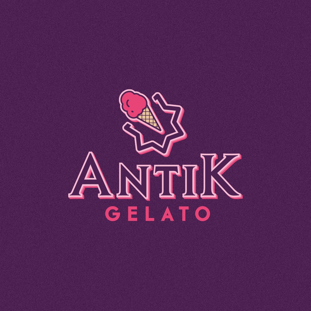
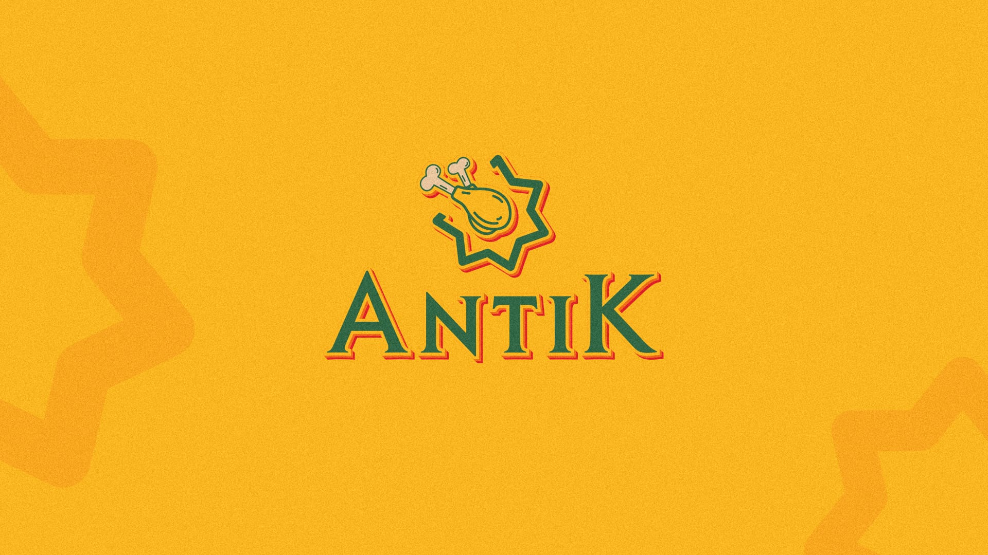
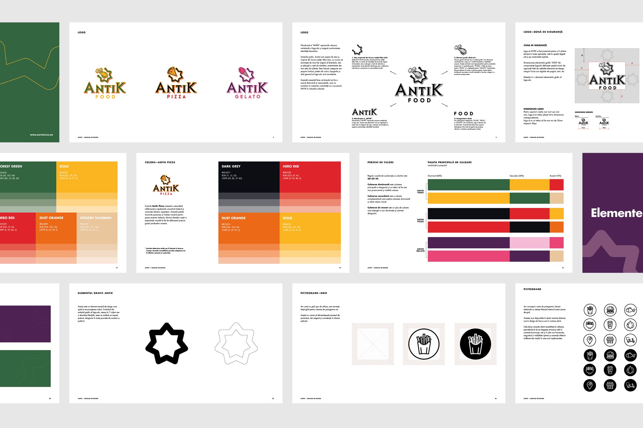
At the heart of Antik’s identity is the seven-pointed star, abstracted from the Alba Iulia citadel. It’s more than a symbol; it’s a declaration of origin that transformed into a graphic system. Not just a symbol of place, but a metaphor: strong, balanced, and made to last.
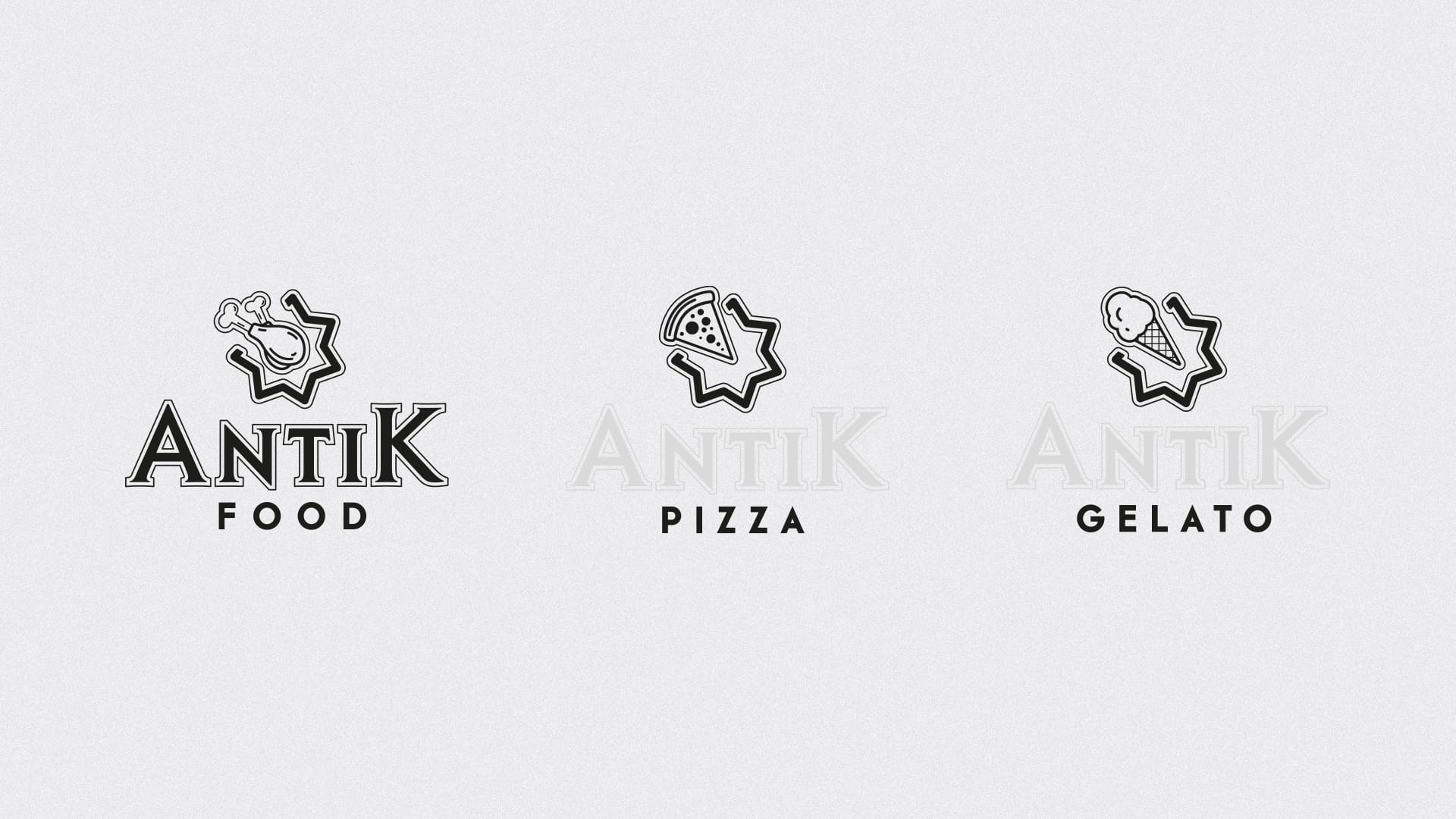
We created a tiered identity system, where everything has a role:
• A bold, geometric wordmark – the constant across categories
• A set of custom icons – one per product line, placed above the wordmark
• A color-coded structure that lets each vertical stand tall, while staying connected
This system gave the brand room to breathe. Each category has its own flavor, but they all feel like part of the same story, sharing DNA but expressing individuality.
A bold, geometric wordmark – the constant across categories
A set of custom icons – one per product line, placed above the wordmark
This system gave the brand room to breathe. Each category has its own flavor, but they all feel like part of the same story, sharing DNA but expressing individuality.
We didn’t settle on the first idea. Or the fifth.
We explored:
• Symbols that felt handcrafted but sharp
• Layouts inspired by symmetry and rotation (like a pizza, yes, but also the citadel itself)
• Icons that were playful but precise
The final mark is a modular logo – the Antik wordmark as the constant, flanked by interchangeable top icons.
Top-layer icons:
The seven-point star? It became part of the brand’s graphic DNA, subtly layered into packaging, signage, and layouts It’s a system that knows when to shout and when to whisper.


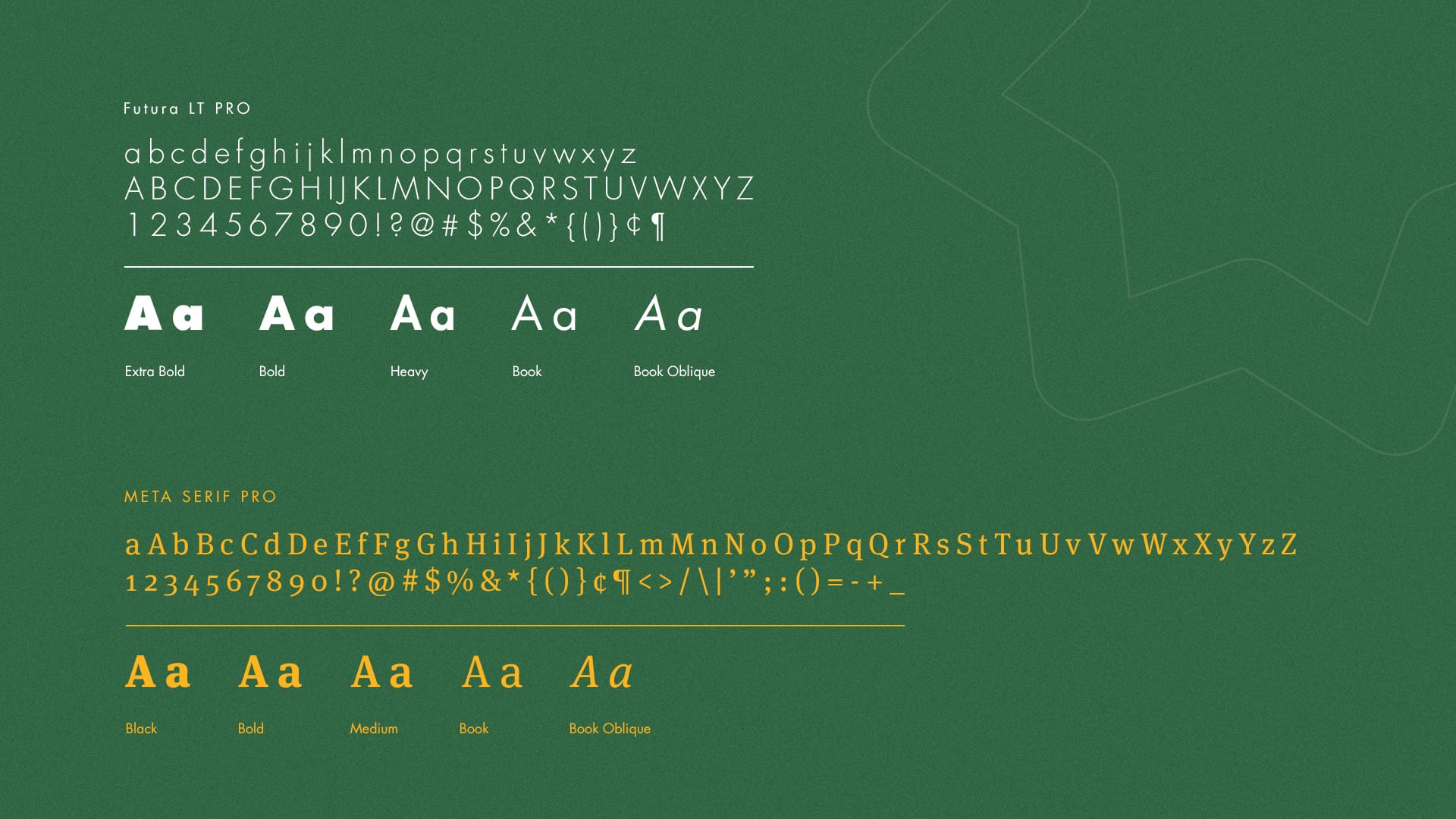
Type and color don’t just decorate, they speak. For Antik, we built a voice with range.
We choose:
• Futura LT Pro – clean, modern, honest for Headlines, categories and signage.
• Meta Serif Pro – human, friendly, made for stories. Used in longer-form text and detailed work.
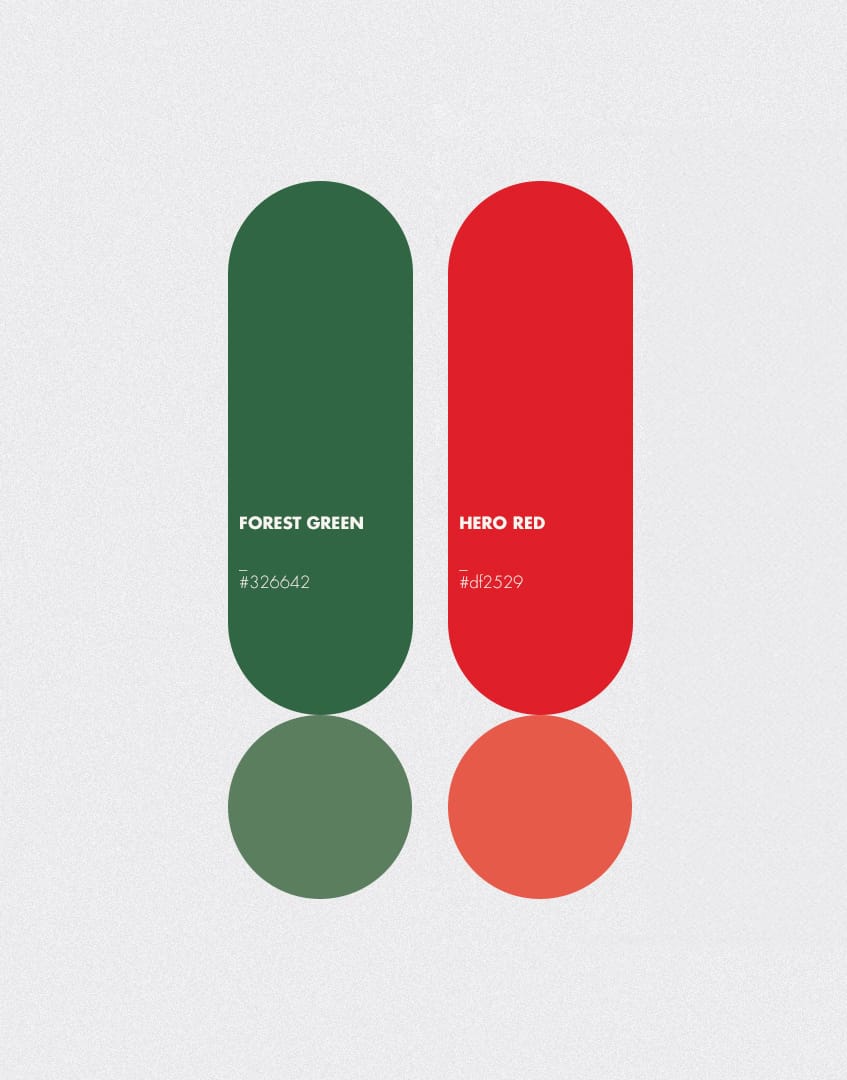
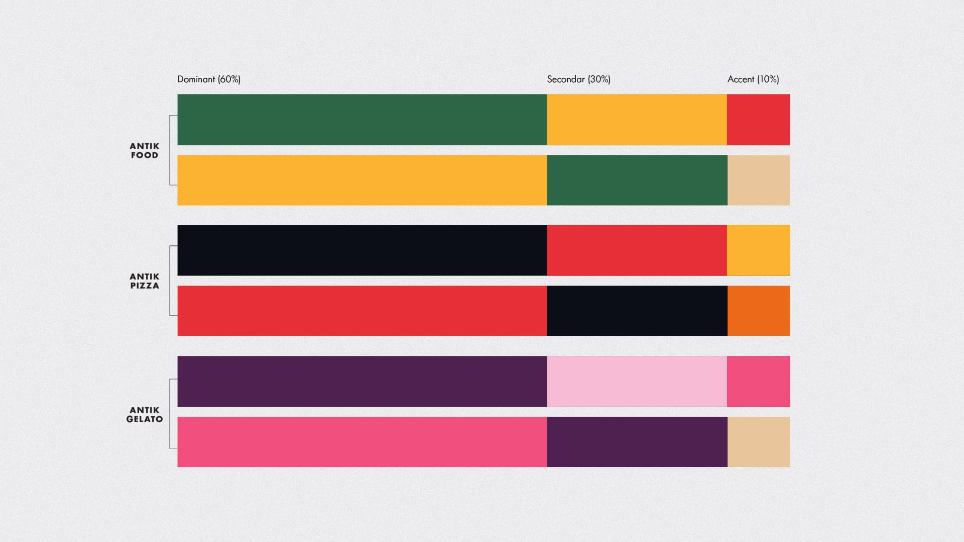
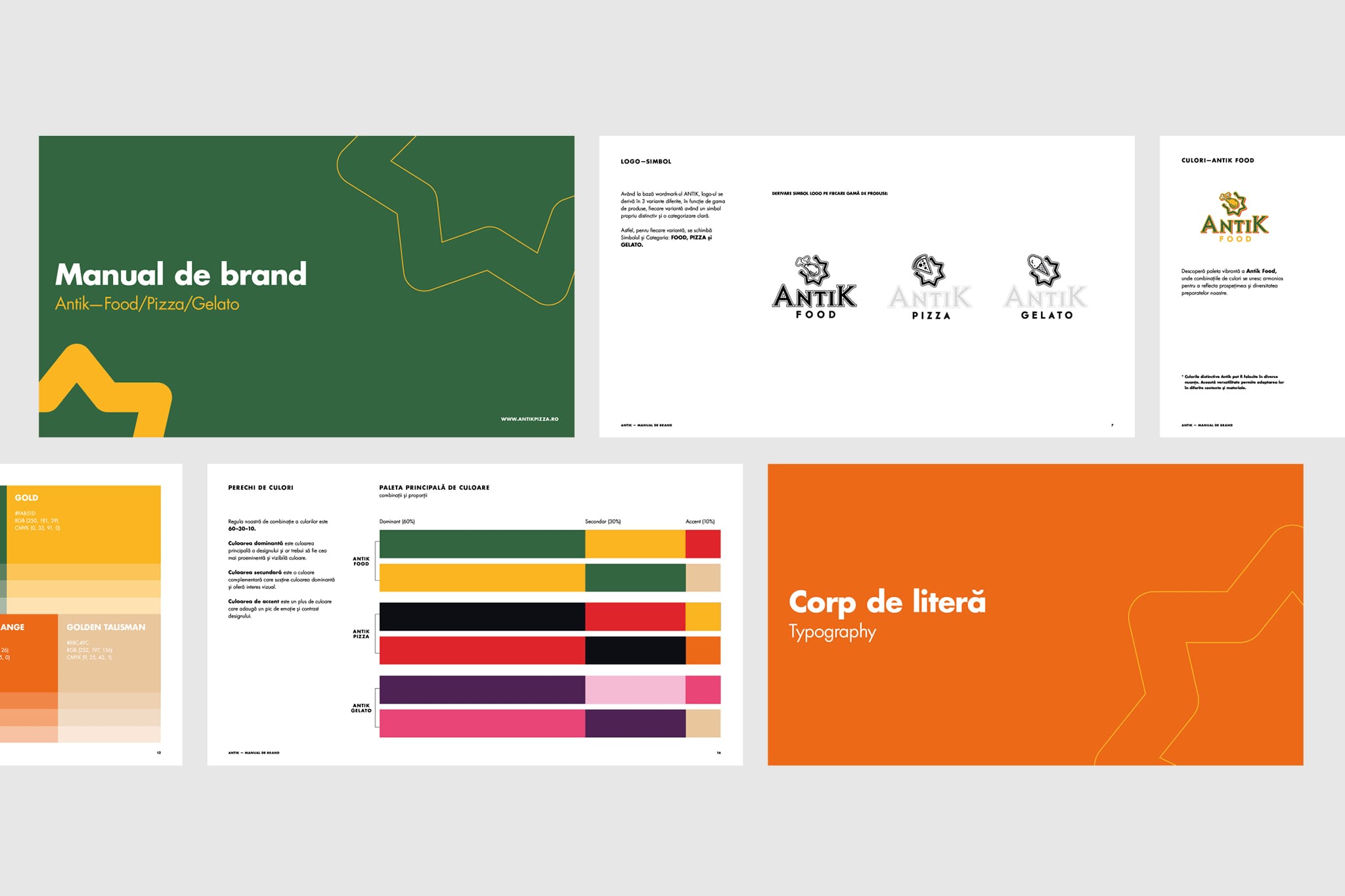
For the Color systems it was best for Each category to have its own palette, designed to reflect tone and taste:
Forest green & Hero red
(hearty, grounded, rich) local sourced ingredients. No crapy ingredients.
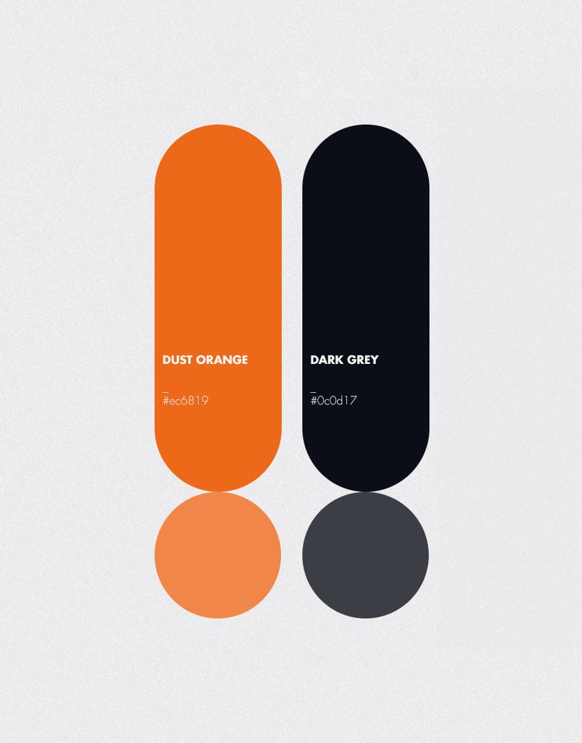
Dust orange & Deep charcoal
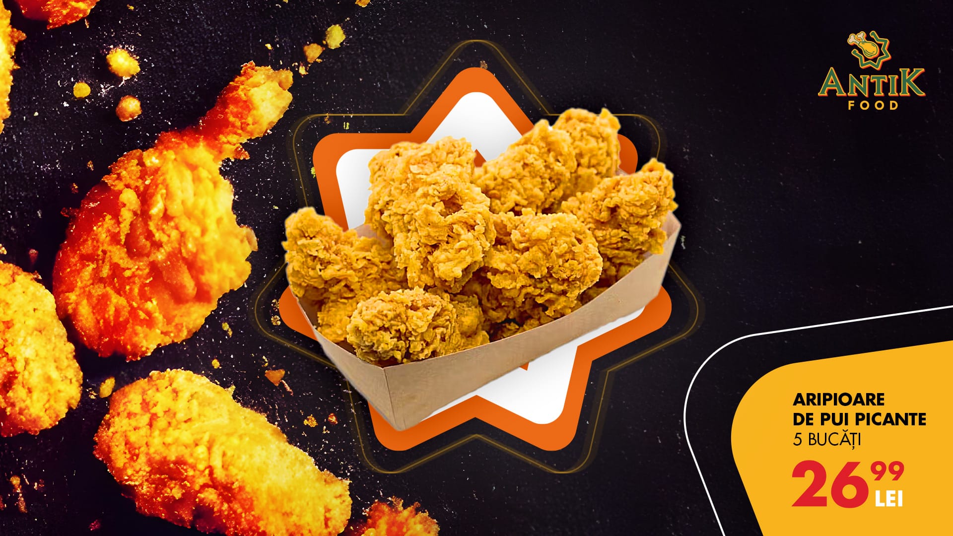
(warm, rustic, comforting) all style oven made pizza in a modern fast-forward world.
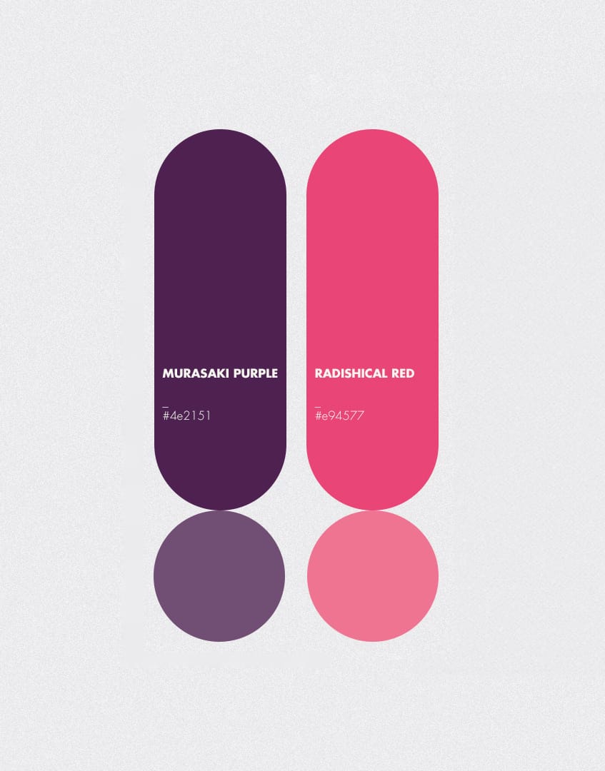
Pastel pinks & Murasaki purple
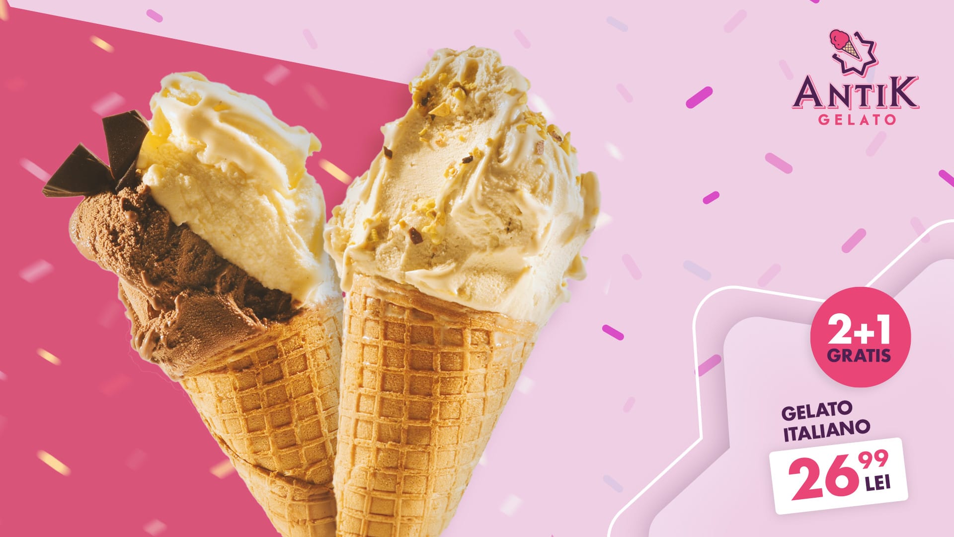
(playful, fresh, joyful) made with natural ingredients, italian artigianale way.
We followed a 60-30-10 rule across all materials – to create visual rhythm and make sure nothing ever looked off-brand
Identity doesn’t live in a PDF. It lives in your hands.
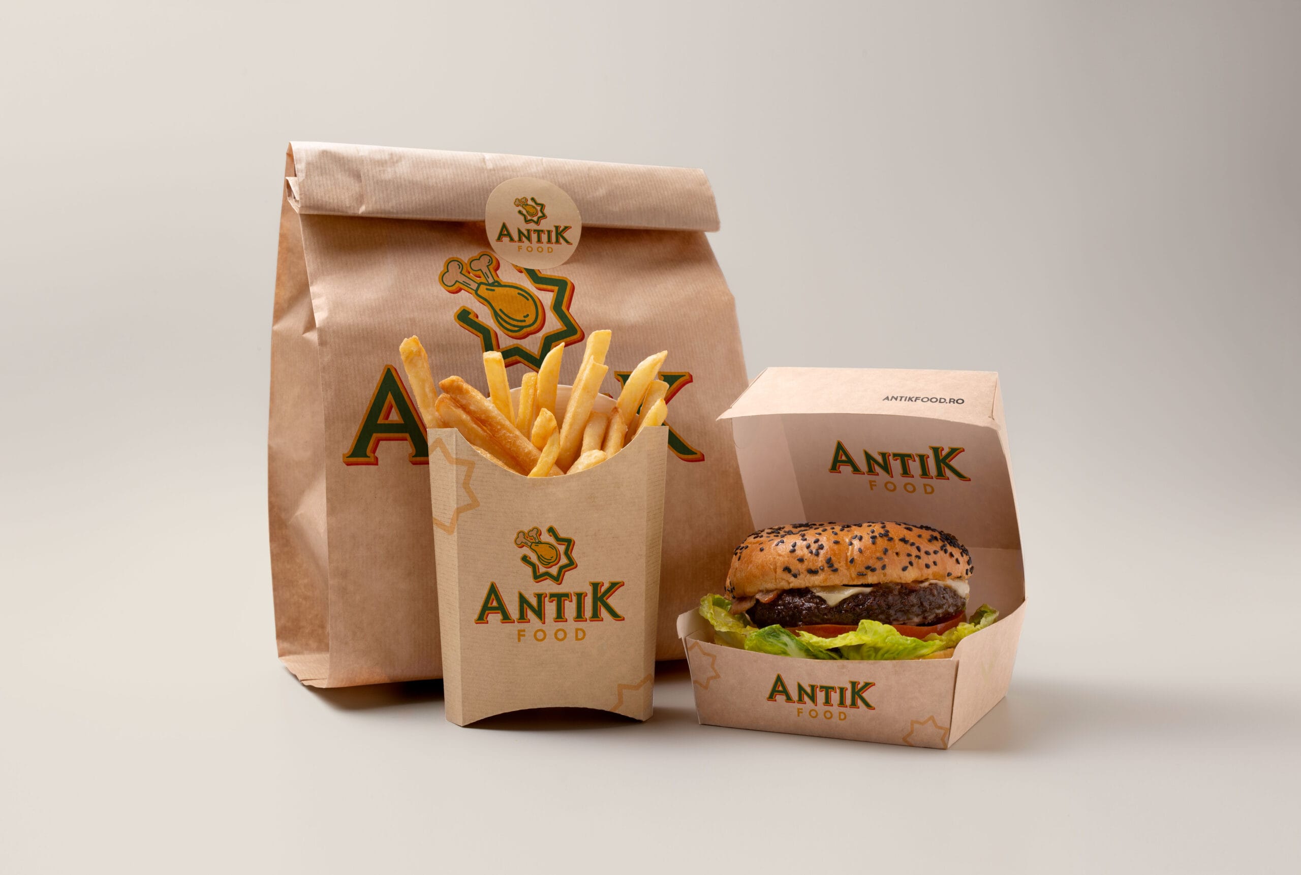
We applied the system across every real-world interaction:
• Pizza boxes that stack up strong – easy to recognize, hard to forget
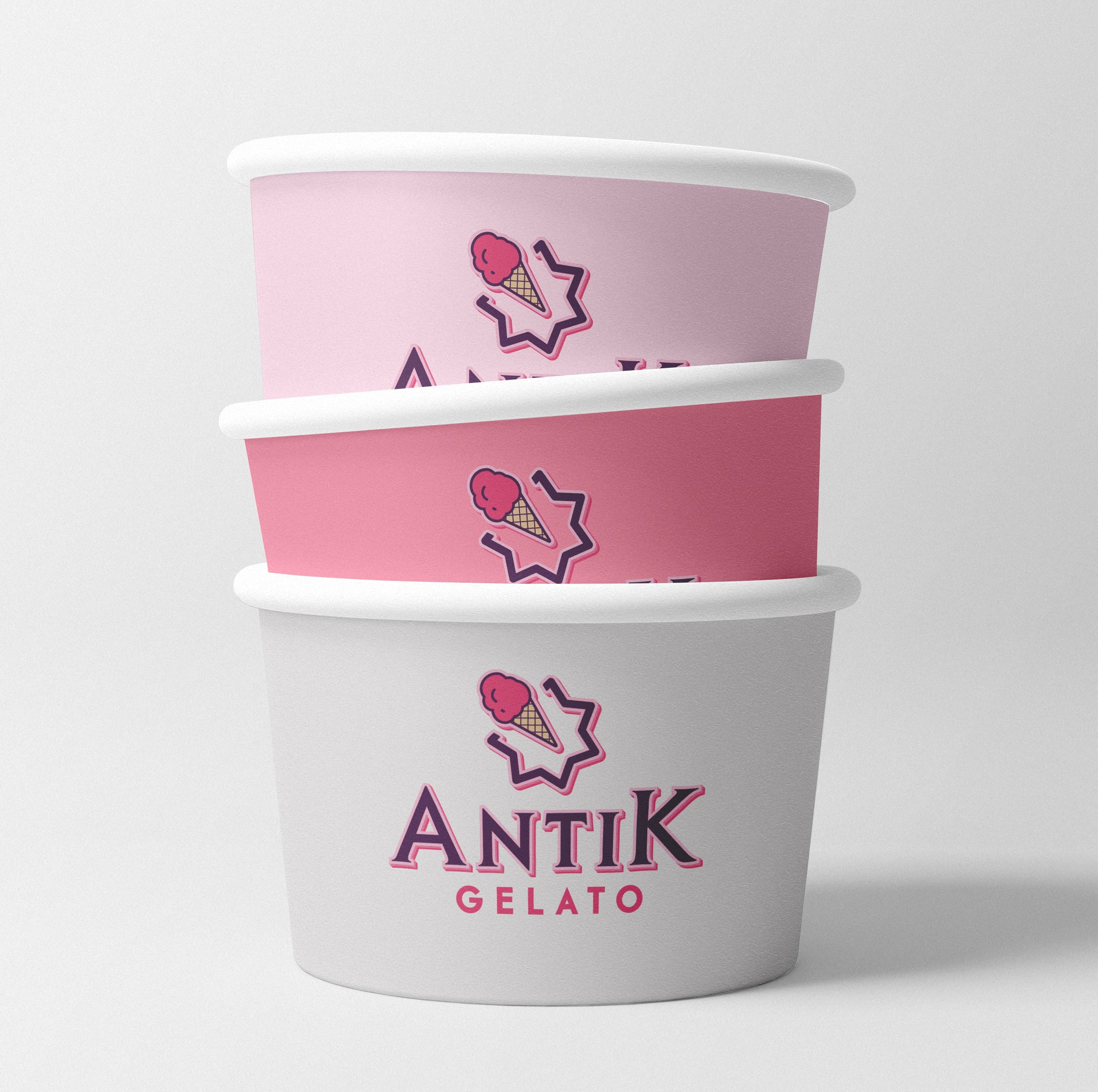
• Gelato cups with just the right mix of softness and pop (also great on Instagram)
• To-go bags, clearly color-coded per vertical – brand cues even while walking down the street
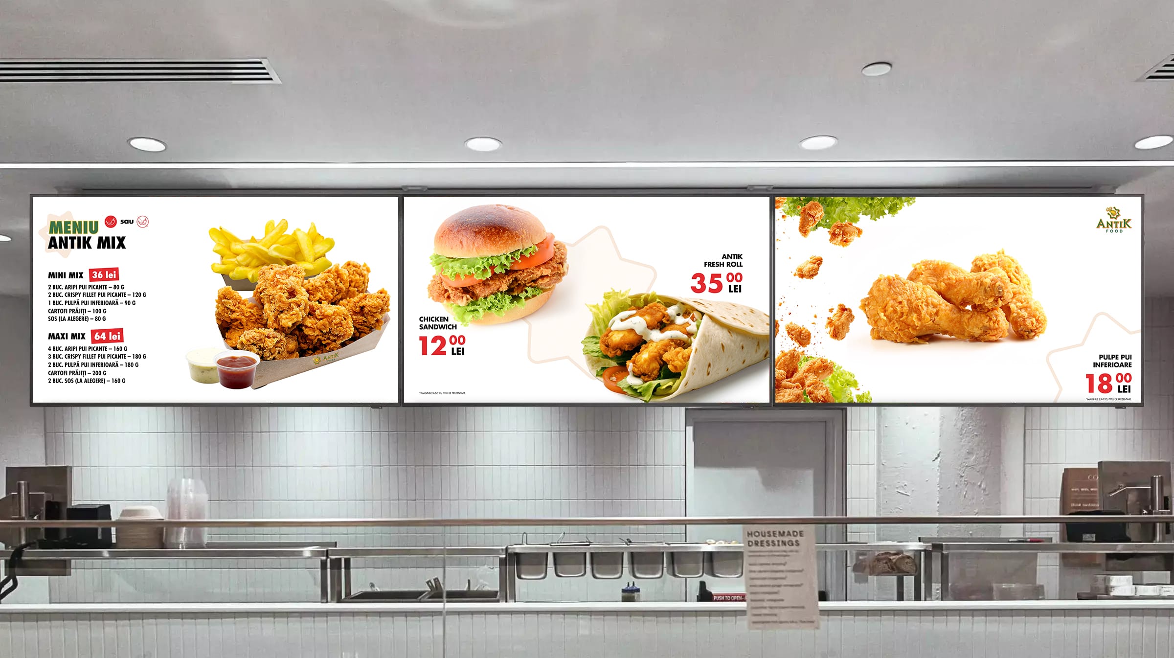
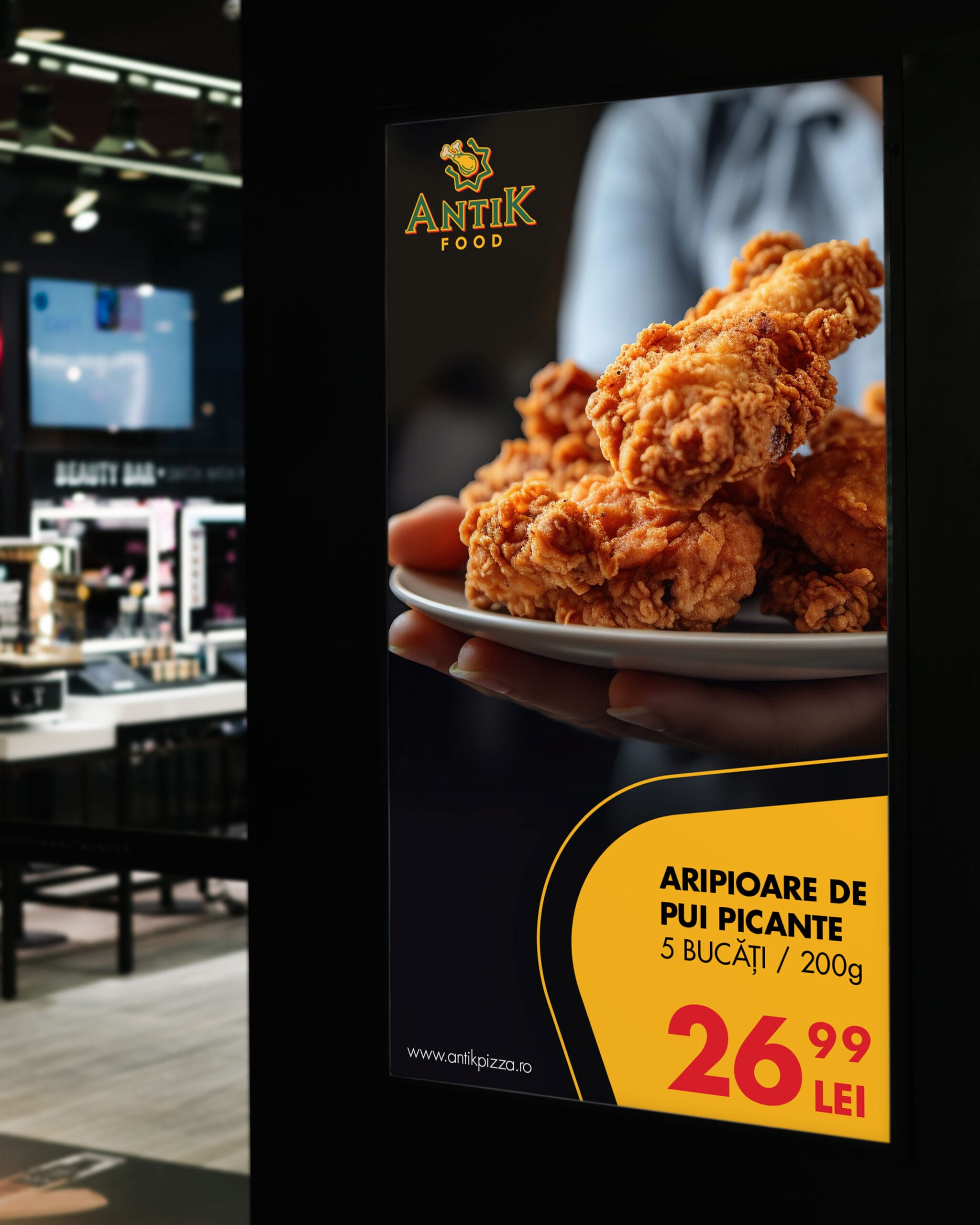
• Menu boards and screen layouts – built for 50″ and 3×55″ displays, with modular frames, animated transitions, and legibility in motion for a shopping mall restaurant meant to draw attention.
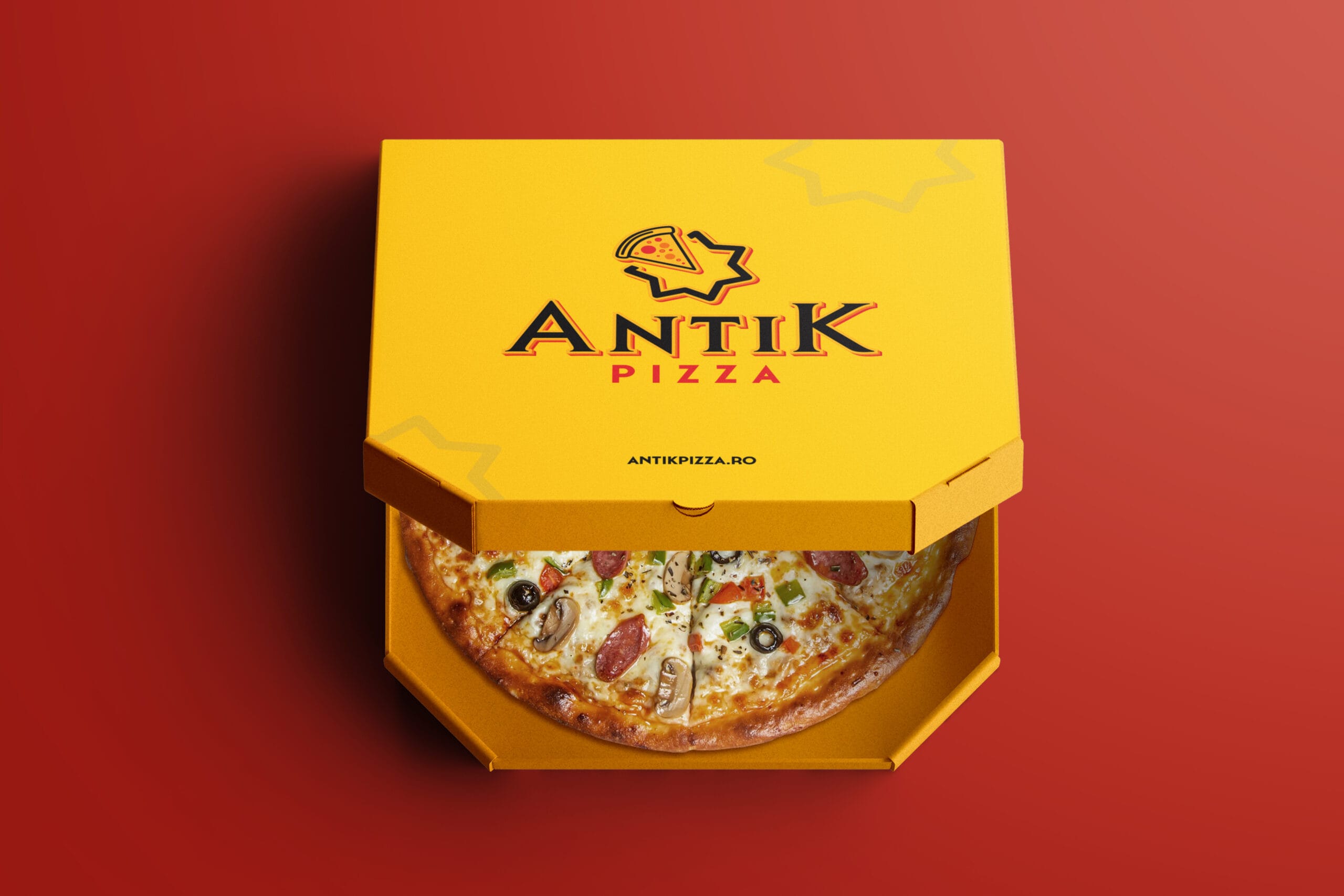
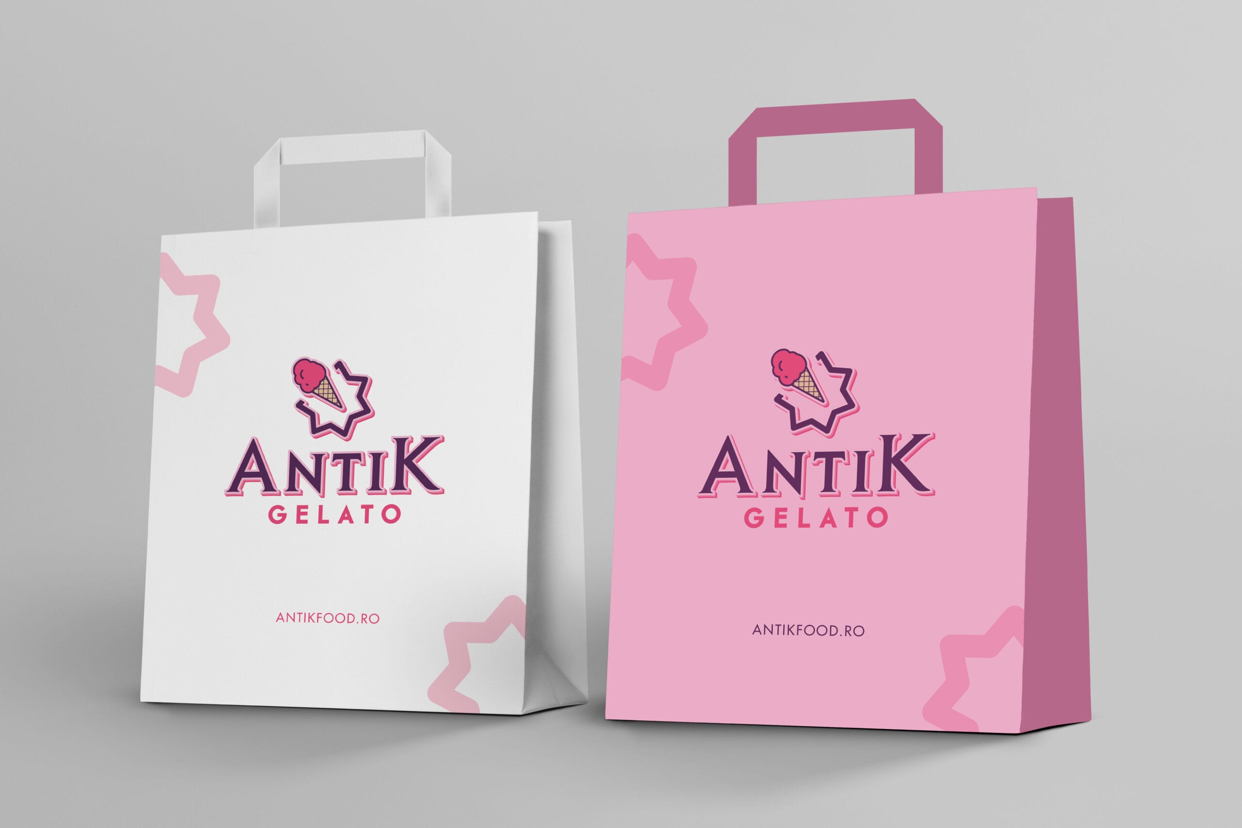
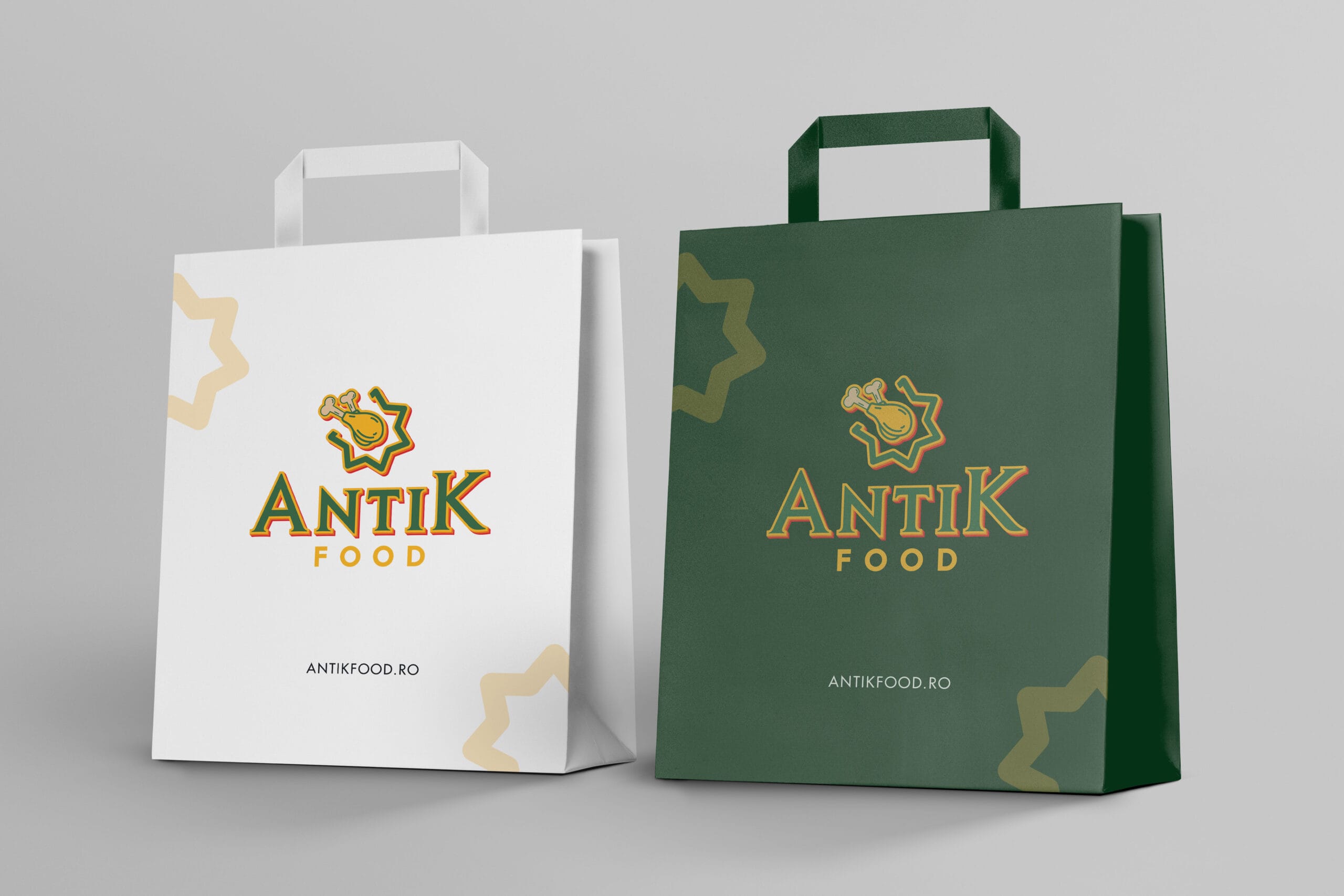
And yes, all of it tied together using the fortress-star grid, our behind-the-scenes hero.
No great identity survives on vibes alone.
We created a comprehensive brand manual, built for real-world use:
• Logo sizes, safe zones, and clear-space rules
• Typography hierarchy and responsive text styles
• Color formulas (print + digital) and usage ratios
• Icon styles, placement rules, and pairings
• Packaging and signage specs
• Screen layout templates + animation pacing guides
This isn’t just a PDF to send around. It’s a toolkit for the Antik team to grow the brand with clarity and confidence.
What emerged is a brand that feels like it’s always been there and now, finally, looks the part. Antik today is grounded in heritage, but designed for movement. It stretches confidently across categories and geographies, while staying emotionally intact. The story of a place, turned into a system. A design you can taste. A feeling you can follow.
And this is where we thrive, building identities that carry meaning, move people, and evolve as naturally as the brands they represent.
So if you’re ready to create something that resonates, something with spine and soul, we’d love to hear your story.
• Brand Strategy & Positioning
• Logo & Identity System
• Visual Language & Icon Set
• Typography & Color Architecture
• Packaging Design
• Signage & Menu Displays
• Brand Guidelines Documentation
