CAU
what we did
graphic Design / creation
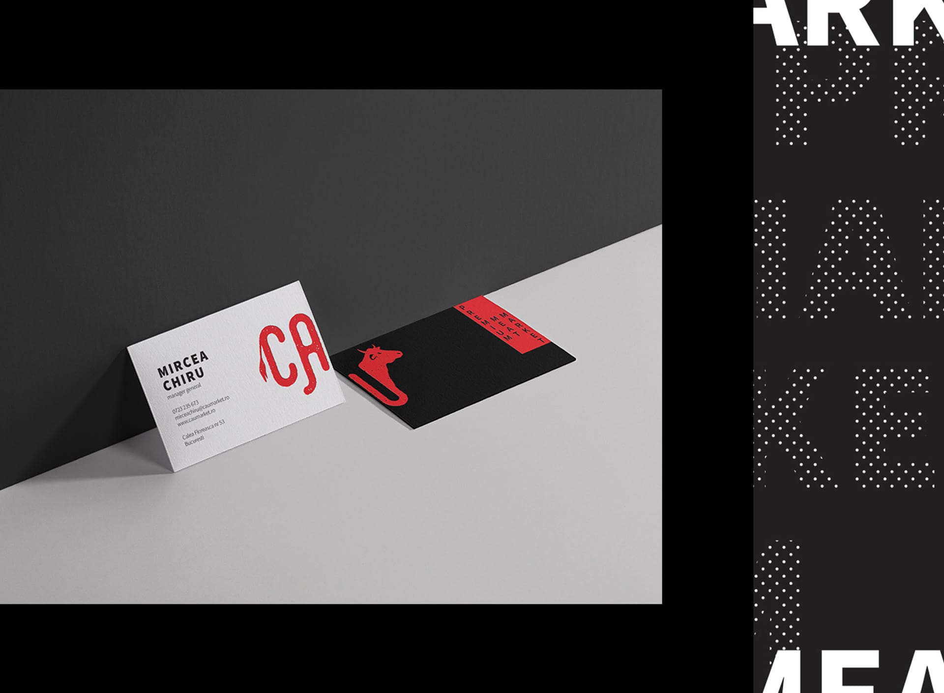
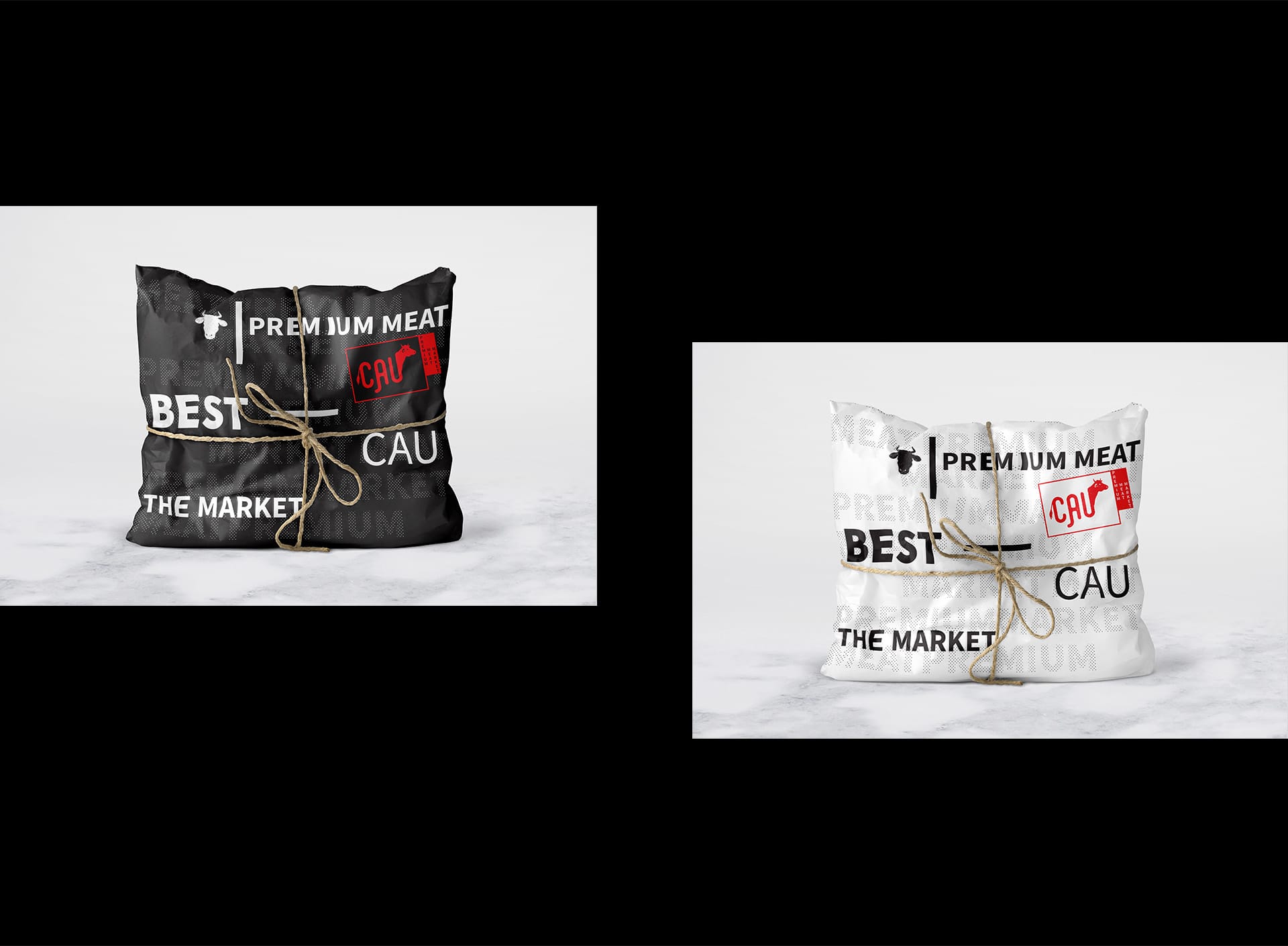
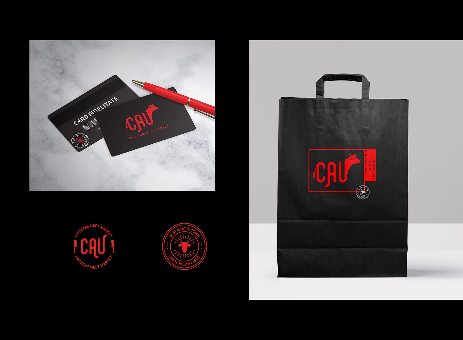
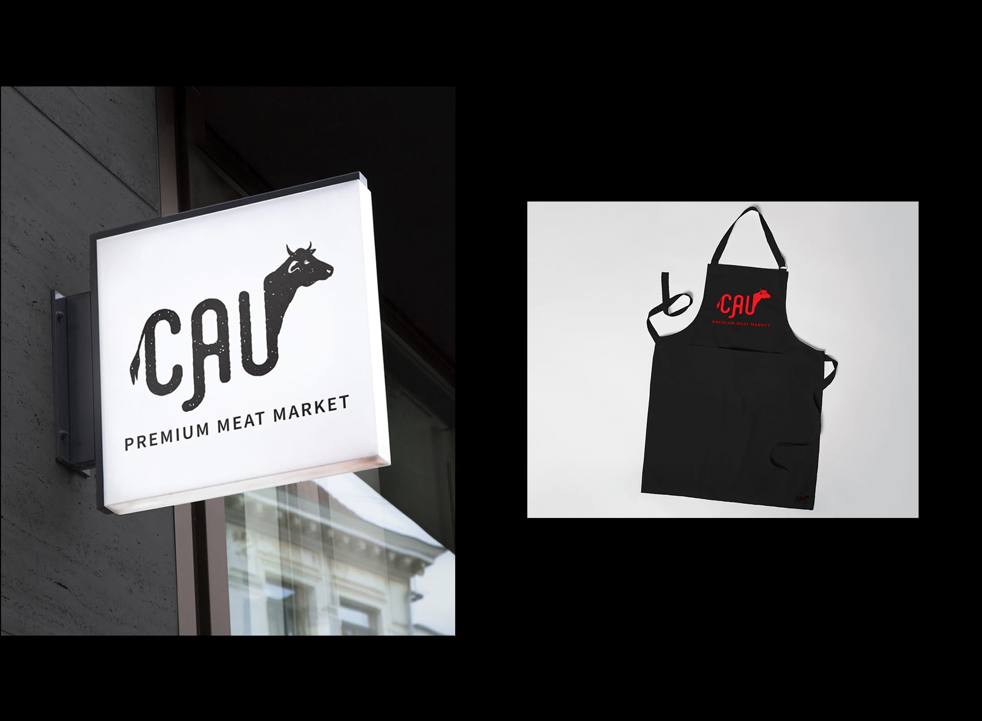
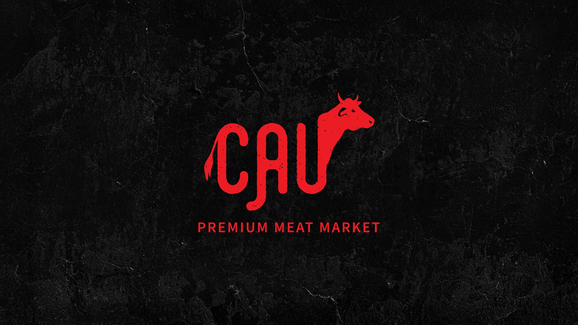
Welcome to Cau, a premium meat market with a bold, modern twist! Our creative team set out to craft a brand identity that feels as premium as the cuts of meat they offer.
From the logo design—a playful, yet strong typeface integrating a cow silhouette—to a striking color palette of Juicy Red, Crisp White, and Deep Black, every detail reflects freshness, quality, and trust. We extended the branding across various touchpoints: elegant packaging, loyalty cards, signage, and even aprons, ensuring a cohesive and memorable experience.
Cau’s visual identity embodies sophistication and a farm-to-table ethos, making it stand out in a highly competitive market. It’s not just a brand—it’s a celebration of premium quality, great taste, and thoughtful design.
Let us know what you think—we’re proud of how it turned out!